the vinylist

An e-commerce website that sells vinyl turntables, speakers, and records.

summary

I redvamped the vinylist’s web platform to improve checkout conversion through research-driven insights, thoughtful redesigns, and iterative user testing.

I redvamped the vinylist’s web platform to improve checkout conversion through research-driven insights, thoughtful redesigns, and iterative user testing.

I redvamped the vinylist’s web platform to improve checkout conversion through research-driven insights, thoughtful redesigns, and iterative user testing.

deliverables

Brand board + Splash page

role + team

UX & Brand Designer

skills

Web design

Project overview

This project was done as a part of my Springbaord education. We were tasked at solving a problem in a certain industry and I chose e-commerce. Initially, the company was supposed to sell bikes but I asked to change it to something that I love- music.

This project was done as a part of my Springbaord education. We were tasked at solving a problem in a certain industry and I chose e-commerce. Initially, the company was supposed to sell bikes but I asked to change it to something that I love- music.

problem

The Vinylist experienced an overall decline in revenue, driven by users abandoning their carts at the registration stage and leaving the site after browsing multiple product pages.

solution

I redesigned the checkout and browsing experience to reduce friction, adding guest checkout and product comparison tools to drive higher conversion and revenue.

exploring the problem

For the assignment, we were given a scenario in which a company (the vinylist) needs to enhance their browsing and checkout experience to greatly improve their product’s usability.

For the assignment, we were given a scenario in which a company (the vinylist) needs to enhance their browsing and checkout experience to greatly improve their product’s usability.

For the assignment, we were given a scenario in which a company (the vinylist) needs to enhance their browsing and checkout experience to greatly improve their product’s usability.

Two problems presented:

Two problems presented:

Two problems presented:

Problem #1

data

50% of users open on average 7 item pages and then abandon the site without moving any items into the cart.

product manager’s hypothesis

Users are unable to determine which vinyl turntable is best based on relative features

my solution

Create a comparison chart so that users can easily compare relative features

Problem #2

data

70% of users who place an item in the cart do not purchase. Data shows that users abandon the cart at the registration page.

product manager’s hypothesis

Users are frustrated that they must make an account to purchase.

my solution

Create a streamlined guest checkout capturing emaill address and password

but first.. research

but first.. research

The first thing I did was delve into research to see how my competitors were attacking the same problem and better understand how of web design may help with conversion.

The first thing I did was delve into research to see how my competitors were attacking the same problem and better understand how of web design may help with conversion.

The first thing I did was delve into research to see how my competitors were attacking the same problem and better understand how of web design may help with conversion.

secondary research

What elements of web design

increase conversion rate?

The secondary research focused on a scientific study done on retail website design and conversion rate. They believe that state of flow increases purchase intention and therefore increases conversion rate. The authors experimented with different aspects of web design in e-commerce sites and examined if flow was increased, decreased, or interrupted. 

Competitive analysis

What are top companies doing

to facilitate conversion?

In my competitive analysis research, I studied the websites of four top performing e-commerce websites (Amazon, Ebay, Best Buy, and Apple).

My goal was to examine how these companies were streamlining the shopping process and ensuring conversion rates. I also wanted to see what features these websites had to compare similar products.

ideation + sketching

ideation + sketching

The first thing I did was delve into research to see how my competitors were attacking the same problem and better understand how of web design may help with conversion.

The first thing I did was delve into research to see how my competitors were attacking the same problem and better understand how of web design may help with conversion.

The first thing I did was delve into research to see how my competitors were attacking the same problem and better understand how of web design may help with conversion.

How might we allow users to easily

compare similar products?

  • I liked the comparison chart on the product description page of the e-commerce websites in my competitive analysis. I specifically liked the look and function of the ones on Amazon and Best Buy the best

  • I also wanted to implement a separate comparison page like that of Best Buy’s so that users can easily choose which products to compare. 

How might we streamline

the guest checkout process?

  • I really liked the checkout flow of Best Buy. When checking out, they present two options: sign in or checkout as a guest. They have an option at the end of checkout to create an account by inputting a password.

  • `I wanted to ensure that users feel they are inputting the minimum amount of information when checking out as guests so I wanted to divide the guest checkout process in two pages: shipping and billing.

branding

My goal was to build a clean, precise interface that still carries the warmth and character of vinyl culture—creating an experience that truly resonates with the target user.
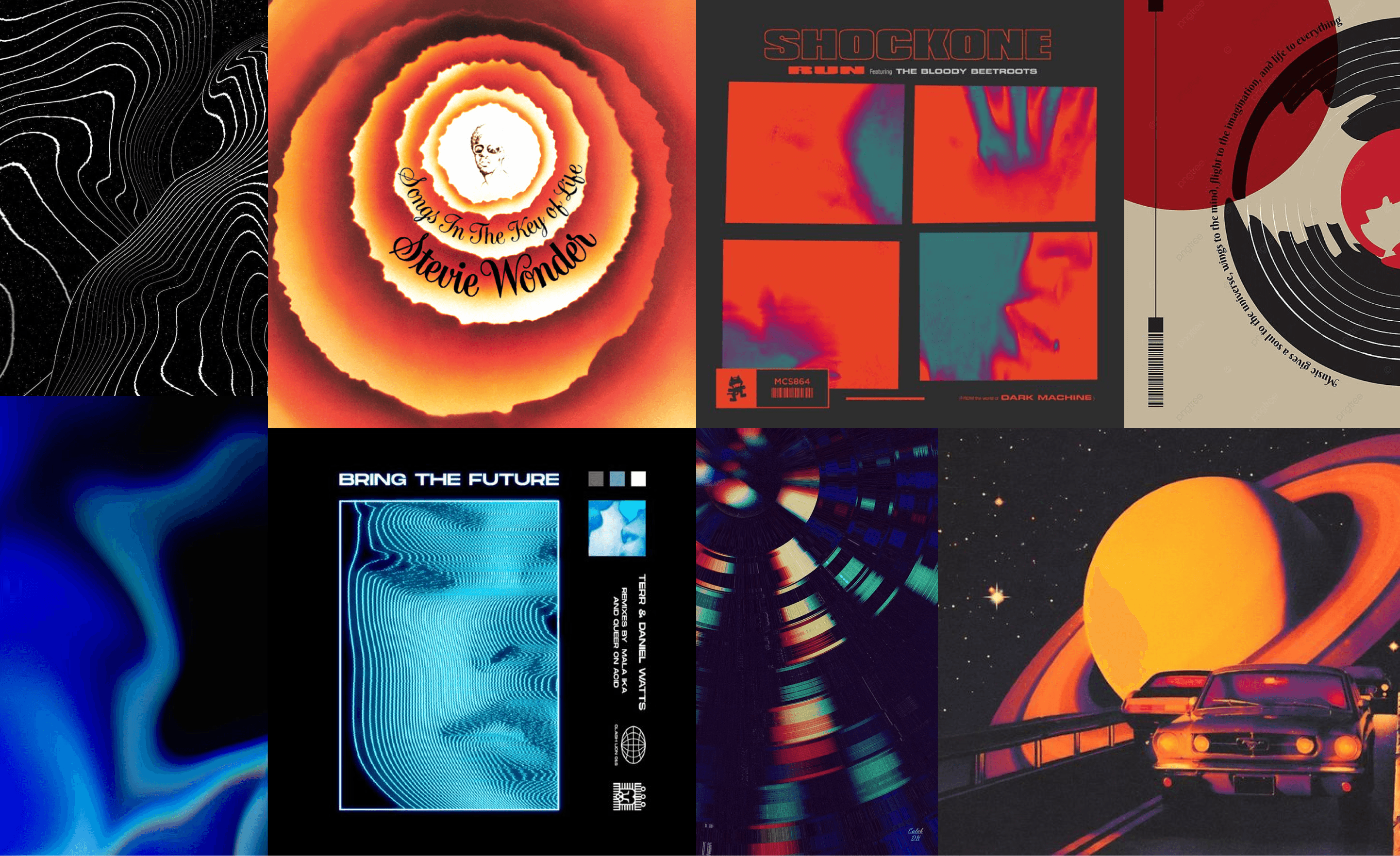
Inspiration Board

I was inspired by different album covers, waves, and vinyl lines. I especially loved the colors of the Stevie Wonder album.

Brand Attributes

I was inspired by different album covers, waves, and vinyl lines. I especially loved the colors of the Stevie Wonder album.

Savvy

Focused

Dynamic

Dependable

Color Pallette

When deciding on the colors for the brand, I wanted to highlight the uniqueness and retro art of vinyl music. Vinyl music is often described as warm, dynamic, and immersive.

Color Pallette

When deciding on the colors for the brand, I wanted to highlight the uniqueness and retro art of vinyl music. Vinyl music is often described as warm, dynamic, and immersive.

Font Family

When deciding on the colors for the brand, I wanted to highlight the uniqueness and retro art of vinyl music. Vinyl music is often described as warm, dynamic, and immersive.

headers/labels

body

Wireframing my solutions

Wireframing my solutions

I designed a total of 5 pages (seen below).

I designed a total of 5 pages (seen below).

The ones I focus on here are the product page and checkout since they include both my solutions.

The ones I focus on here are the product page and checkout since they include both my solutions.

1

Home

Home

2

Products

Products

3

Product Page

Product Page

4

Cart

Cart

5

Checkout

Checkout

Problem 1:

Users are unable to determine which vinyl turntable is best based on relative features

Solution:

Implement a comparison chart & comparison page to allow users to easily compare products to ease conversion.

Product Page

DESIGN CHOICES

  • “Vinylist Notes”: expert notes on turntable features

  • Can view similar products and easily compare them

  • Easy to compare important features (specs, price, rating) with a “chart view”

Comparison Page

DESIGN CHOICES

  • Allow users to easily select the models from the products display page.

  • This page also includes way more information such as more specs, photos, ratings, and availability.

  • Users can “save comparison” so that they may go back to a snapshot view of selected turntables for return to flow when ready.

Problem 2:

Users are frustrated that they must make an account to purchase.

Solution:

Implement a guest checkout to enable users to conversion without disrupting flow.

Guest Checkout

DESIGN CHOICES

  • Two clear separate paths when checking out

  • Allow users to sign in with apple and google to easily input information required to checkout

  • Require the least amount of information possible to purchase

Order Confirmation

DESIGN CHOICES

  • Allow users to cancel order easily to decrease frustration if mistake made

  • Easily display all information to confirm information is correct

  • Allow input password so that user may seamlessly create an account during the guest process

usability testing

I made a script and decided on the questions I wanted my participants to complete. I tested 3 participants who met the requirement of shopping for products online.

I made a script and decided on the questions I wanted my participants to complete. I tested 3 participants who met the requirement of shopping for products online.

Test Objective

  • see if users can easily navigate the website’s features (mini menu, filter, comparison feature, guest checkout features)

  • gain feedback on overall UI

iterations

Based on the valuable feedback I gained from my usability testing, I made a few changes:

Home page:

1

Change banner text colors to a bright red-orange

2

Change “audiophiles” to “high-end”

Products display page:

3

Put stroke around each item picture that users will know that they can select these ones

4

Changed “Select Models to Compare” to bright red to be more noticeable

Final Prototype

Final Prototype

Final Prototype

link to website

Reflection

what info is necessary? What type of layout would provide a balanced but experience to lead the user to CTA?

results

Designed a brand and splash page from the ground up for an early stage start up

Received positive feedback from the founder and key stakeholders

Established a clear, conversion-oriented foundation for future product growth

reflection

Overall, I think the problems were solved effectively. My main constraint was time but I was still able to create something I am really proud of. Getting feedback on my designs is always helpful and I am beginning to love showing my work to my friends. This project definitely put my Figma skills to the test (charts galore) but I loved designing in the e-commerce and media space. I hope to work on many more projects in these fields in the future!

key takeaways

Things that are noticeable to me might not be noticeable to all users

Things that are noticeable to me might not be noticeable to all users

During testing, users were unsure of how to select products to compare on the products display page. Although I could notice it well due to the bright orange text. I noticed my users had trouble finding the “compare” button. I made sure to make it pop by filling it with the orange color which resulted in users being able to find the button.

The primary color shouldn’t be used at every chance

The primary color shouldn’t be used at every chance

While designing the high-fidelity wireframes, I utilized the primary color (cinnabar) everywhere I could. However, I found that this takes away attention from my call-to-action UI elements. In the future, I will play around with adding more of the secondary color or playing with opacity to give the primary color its moment.

“Flow” is an important factor in the e-commerce world

“Flow” is an important factor in the e-commerce world

During secondary research I was introduced to the concept of flow in the e-commerce frame. I thought of how I online shop and remembered how many times I was frustrated with registration, banners, bad websites, and etc. I realized these “disruptors of flow” stopped me from purchasing items many times. Moving forward, I will make sure to keep flow in mind so that users have a streamlined web experience.