Rackem
A mobile app for pool players to find and reserve tables + more

summary
I built a billiard mobile app from the ground up using the UX Design process.
deliverables
role + team
skills
problem
Through secondary research and interviews, I uncovered the most common frustrations of playing pool are: waiting for a table and inconsistency between a in person experience and what is represented about it online.
solution
Create an all-in-one app for billiard players that features a waitlist/reservation feature and comprehensive and clearly represented information on places with pool tables.
exploring the problem
The experience of playing pool can be unsatisfying sometimes
problem
Waiting for a table
effect
Low satisfaction levels & dampens the experience of service
solution
Reservation & waitlist feature to reduce time spent waiting for a table
problem
Disconnect of what is being shown online about pool halls and experience of going there
effect
solution
Clear icons, user inputted reviews, & verification of information to show users exactly what to expect
primary research
What common pain points do pool players have?
I conducted 3 interviews with other pool players to hear about their pool playing experiences, desires and pain points. Through my interviews, I gained valuable insight into my interviewees’ pain points such as waiting for a table, and disconnect of what was shown online about pool halls versus the actual experience of going there.
secondary research
What are the effects of waiting?
I knew that one major frustration I had was waiting for a table and wanted to explore what waiting does to both customers and businesses alike. I found that waiting time was directly negatively correlated with the satisfaction levels of the consumers. Waiting long periods also dampens the experience of the service being provided and causes businesses to lose revenue and customers.


user persona
My target users would be pool players, of course! Whether beginner or advanced, I wanted Rackem to be intuitive, easy, and fun to use.
I created a persona to capture the user I want to design for to stay focused when empathizing and ideating. Mike Minnow (seen below) is a 35-year-old bachelor living in Los Angeles. He is friendly, competitive, and eager. He has played pool for about 3 years and plays any chance he gets.


Mike Minnow
35; Los Angeles, CA
Product Designer
Friendly
Competitive
Eager
goals
Pain Points
Driving across LA only to find long wait times and waiting 30-60 minutes for a table
Online photos of pool places that look amazing but don’t reflect reality
Feeling like he’s wasting time when he just wants reps
ideating + Sketching
a) How might we help pool players find pool halls?
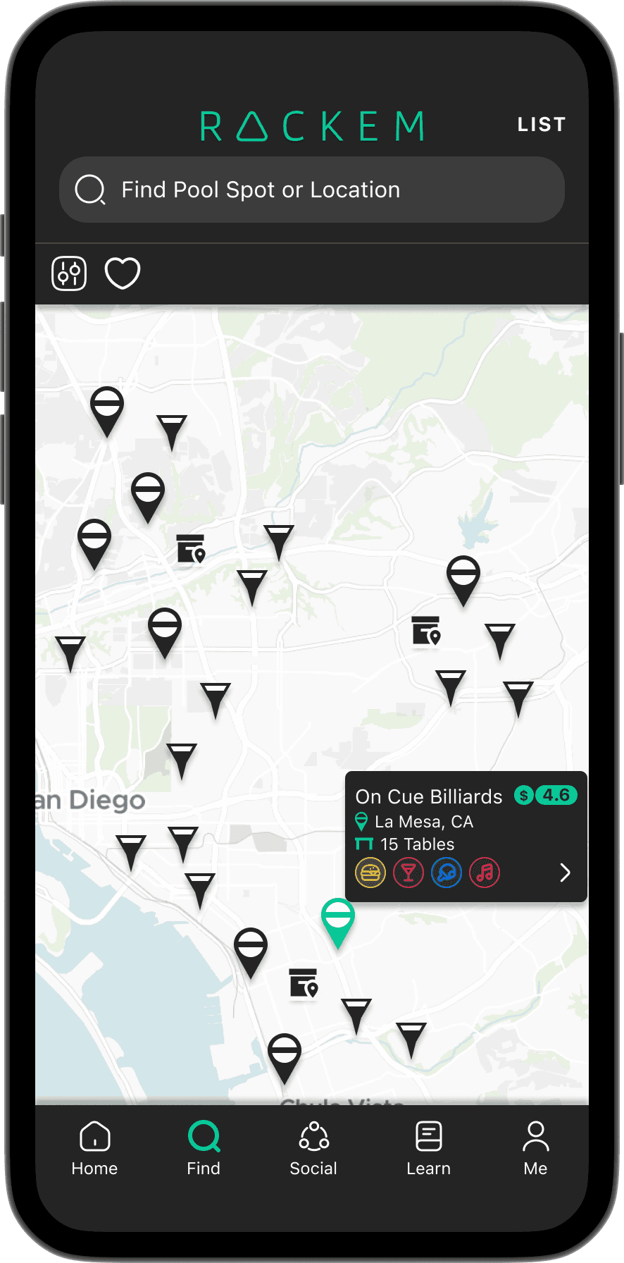
Mimic Yelp to adopt a familiar map and list format for users
Utilize icons/colors to differentiate between pool halls, pool bars, and pool stores
Implement mini menu when clicking pool place icon for quick glance at the name, location, how many tables, and amenities offered

b) How might we improve the accuracy of what’s being represented about pool halls?
Add pool specific sections such as pricing, league, and amenities offered
Input user-inputted tags & reviews to see what other users are saying about the place
Hours and location verified: like Google does to improve accuracy of pertinent information presented

c) How might we aid pool players to maximize pool playing time?
Since I found out that pool players want to get on the table and waiting for a table stops them from doing so, I believed a reservation and waitlist feature would be super helpful in reducing lines and overcrowding
Just as Yelp and OpenTable, Rackem could help players reserve tables and also join the waitlist when within a certain radius of the pool spot.

d) How might we connect other pool players together?

sitemap
I knew my app had a lot of features but boiled it down to these four:
1. Keep score
2. Look for a pool hall to play at
3. Join a group
4. Learn to play 8 ball

BRANDING
After mapping out the site, I crafted Rackem's brand to feel reliable but fun and appeal to the target audience.


Color Palette
Rackem’s color palette was inspired by real billiard elements such as a lit up green felt pool table, blue Diamond pool tables, and billiard balls. I wanted cool, retro colors to keep the mood classic yet fun.


Problem 1:
Waiting for a table
Solution 1:
Users can reserve tables and additionally waitlist for them when within a 5 mile radius.
Users may see how many on a waitlist without being within the radius.
I would expect pool halls to have a few tables for reservations and a handful for walk-ins depending on what is going on that day.
In addition, users may see how busy a pool hall is at the current time, how many tables there are, what other games/entertainment may be available to lessen the frustration of waiting.


Problem 2:
There is a disconnect of what is being shown online about pool halls and experience of going there
Solution 2:
Users can search for places with pool- with clear icons distinguishing between pool bars, halls, and stores.
Users can have a quick overview of a pool place through the search feature- telling them price range, rating, how many tables, and whether they have a full kitchen, bar, other games, and jukebox.
Location and hours verified by Rackem to ensure accuracy.
usability testing
Tasks
Create an account
Results
Easy for all but 2 users had comments about the “skill level” section.
Your friend wants you to make a reservation through the Rackem app. He wants you to make the reservation at On Cue Billiards for 2 people at an 8 ft table on November 2 @ 5 PM.
“Simple” and “easy to naviagate”
One user was unsure if the reservation was confirmed or not
Your friend tells you about a group on the app called San Diego Pool Lovers. Join the group.
The hardest of the tasks for users as it was hard to navigate to the “discover” icon to find the groups.
You are playing 8 ball with friends at a pool hall and have an argument about the rules of breaking. Use the app to look up the rules.
A “confusing” task to complete due ot the nomencalture of the tabs on the 8 ball page.
Users unsure if the tabs were breadcrumb and found the tab “rules” unnecessary.
Any comments on the learn page UI?
The participants liked the learn page but thought the 8 ball page looked “off”
Did not like the layout.
Give users option to connect to FargoRate for skill level
Pop-up of “reservation confirmed” to clear ambiguity
Add labels to icons on social page to clear ambiguity
Improve UI and readability of 8-ball page

high fidelity prototype


Reflection
results
Designed a brand and app from the ground up using the UX process
Received positive feedback from my mentor and peers
Improved skills in Figma
reflection
I learned a lot creating Rackem from the ground-up. I learned that the UX Design process is not a linear process and there is a lot of iteration after each step. I also learned that research and the steps taken before designing is imperative in designing a useful and well-received product. After completing this project, I learned to be better with labeling my files in Figma, setting up my interviews sooner, and managing my time better when designing. I look forward to completing more projects in a team in the future.
key takeaways